Dexter

Shop luxury designer ready-made clothing and accessories on Dexter platform. Discover the latest trends, elevate your wardrobe effortlessly, and experience high fashion shopping at your fingertips.

Overview

Dexter Inc. is a company that offers innovative solutions for enterprise clients, focusing on providing seamless digital experiences. I was brought on as a UX/UI Designer to enhance the user experience across their platform and create a visually appealing, intuitive design. The goal was to improve user engagement and streamline the platform’s functionalities for a smoother user journey.

Role

UX/UI Designer, Visual Designer

Responsibilities

UI design, UX research, Visual design, Branding

Challenges

The Dexter platform had a complex feature set that often confused users, particularly newcomers, due to its unintuitive navigation. There were also issues with design consistency across different pages, creating a fragmented user experience. Additionally, the lack of a clear onboarding process made it difficult for new users to get up to speed quickly, contributing to a steep learning curve and user frustration.

Approach

To address these challenges, I began by conducting user research through interviews to uncover pain points and understand user expectations. I then designed wireframes and prototypes to iterate on user flows and refine the visual direction. A design system was implemented to ensure consistency, while simplifying the navigation structure to create a more intuitive experience. I also developed an onboarding flow to guide new users through the platform, making it easier to get started and reducing friction.

Project goals

UX RESEARCH USER FLOW PROTOTYPE

User Flow

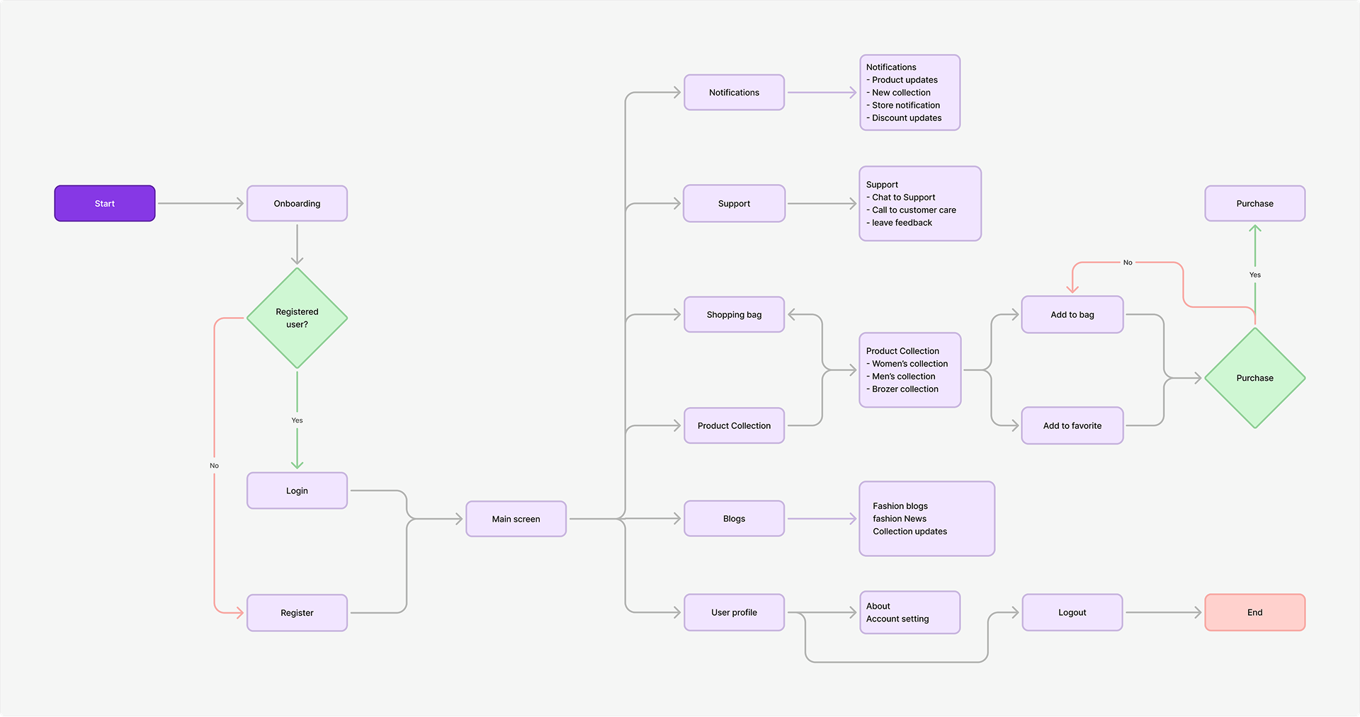
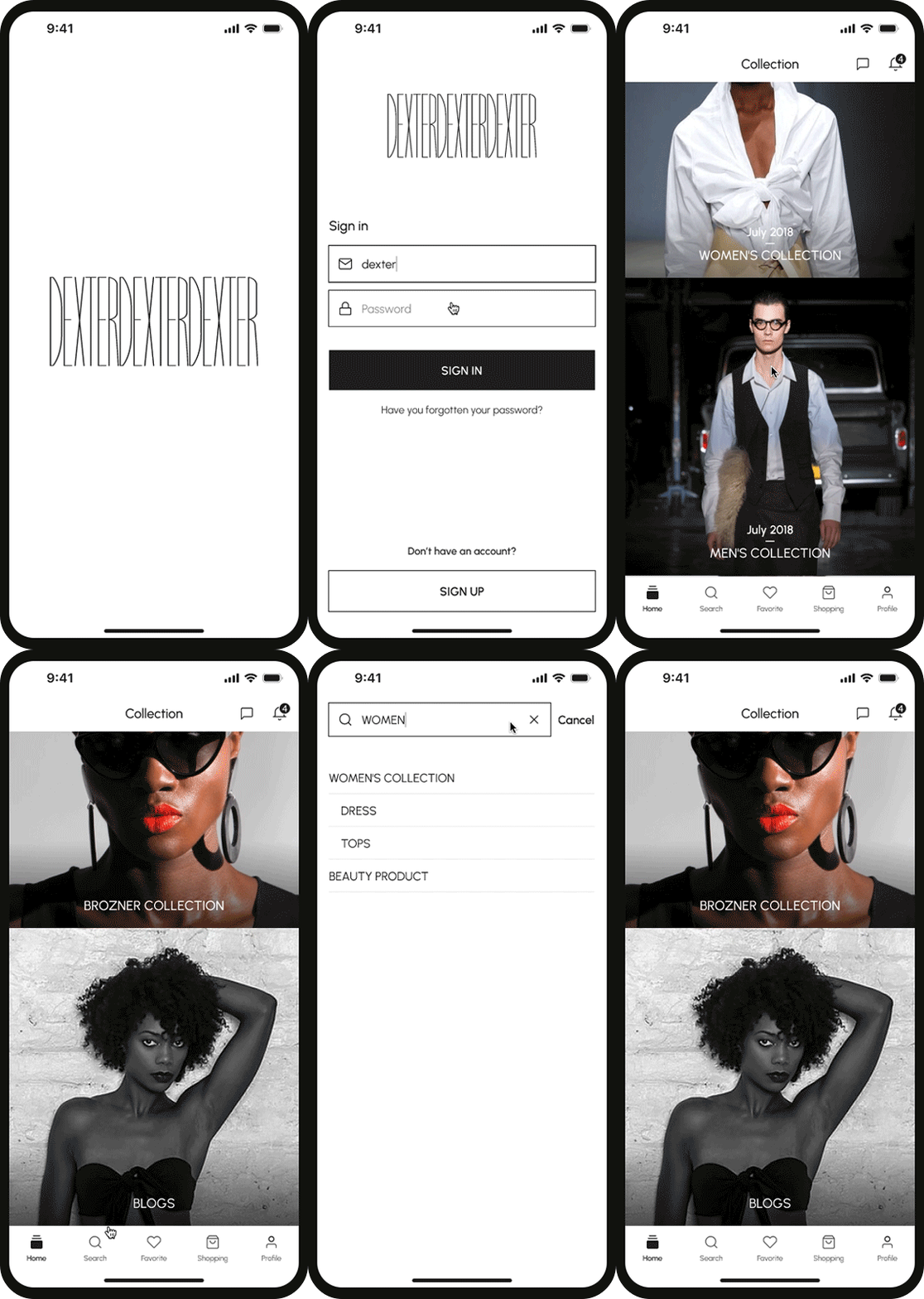
The user flow starts with a clean and minimalist homepage that directs users to essential features, followed by an easy account setup process. Once logged in, users are taken to a personalized dashboard that aggregates key metrics. From there, they can explore various features through a simplified menu structure, taking action via clear calls to action. The flow is designed to ensure users can quickly find what they need, with support and feedback options available for seamless assistance.

Low-fidelity Prototype

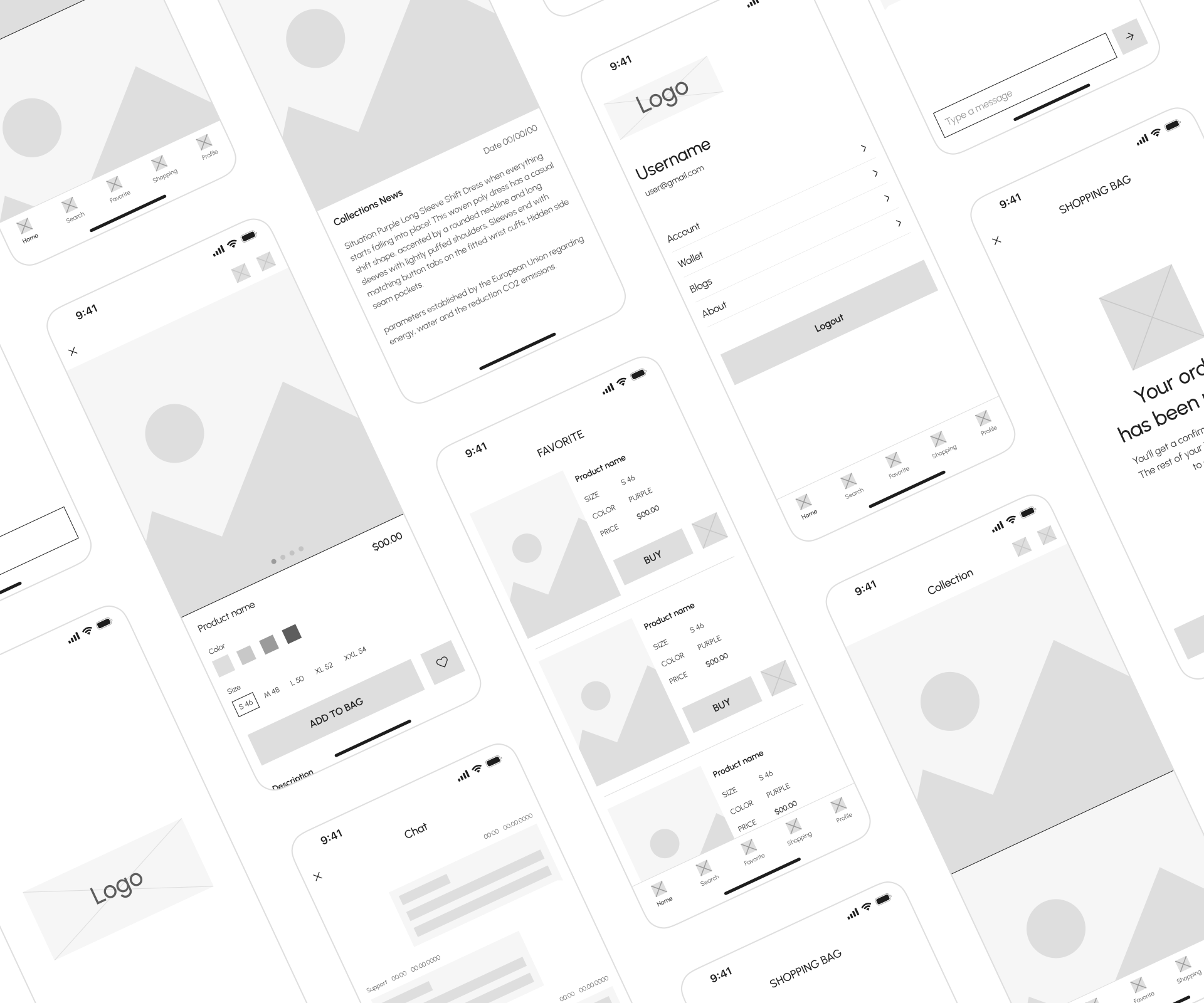
After defining the information architecture, I created low-fidelity designs to translate conceptual ideas into tangible layouts. These designs served as blueprints for the interface’s basic structure, layout, and functionality. Through iterative refinement and feedback, I aligned the designs with user needs and design objectives before advancing to higher-fidelity iterations.

UI DESIGN DESIGN SYSTEM PROTOTYPE

Design system

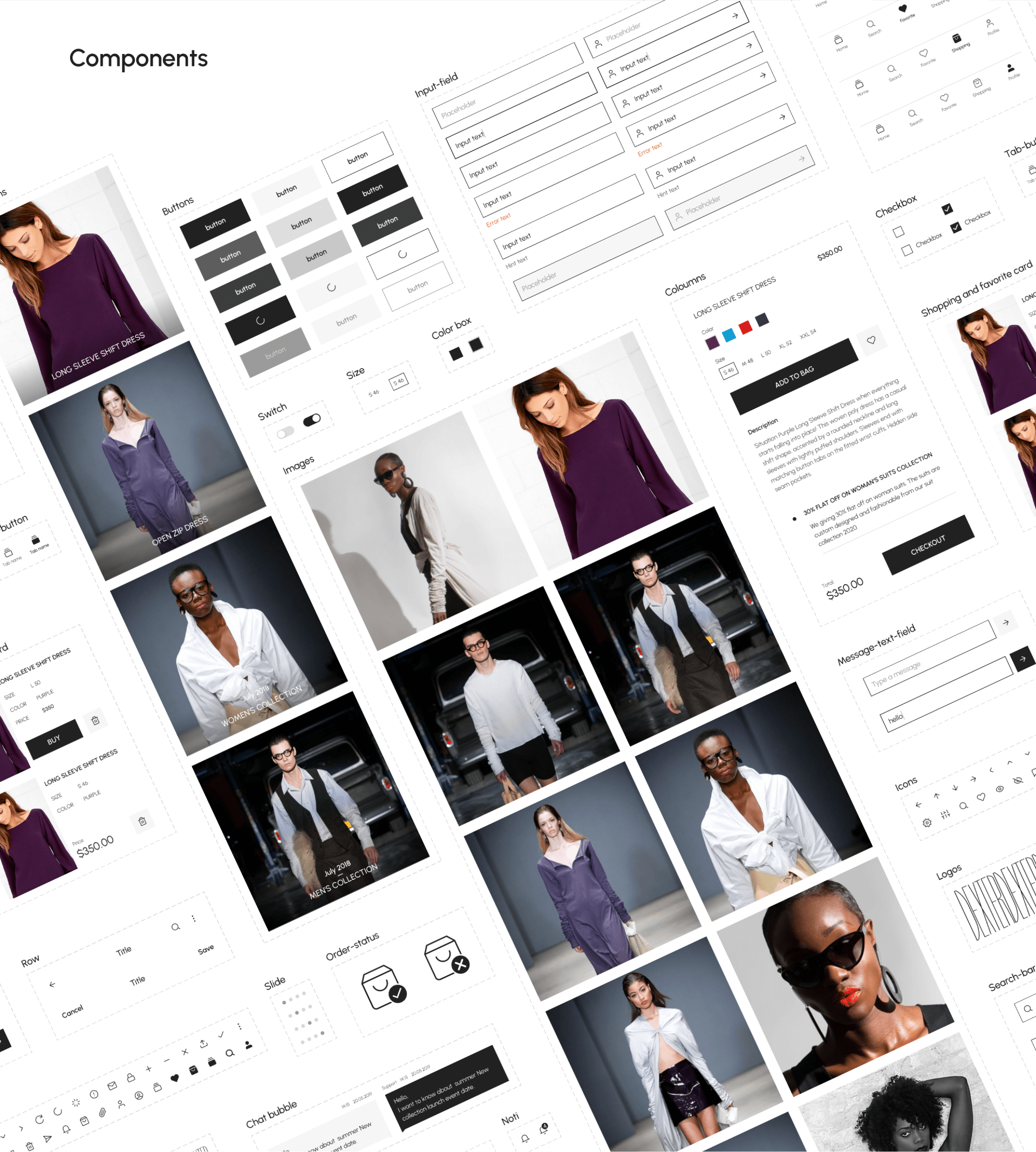
The design system includes key details about the color palette, such as hex codes and transparencies, and typography, including font types, weights, and sizes. Additionally, I developed a collection of components with relevant variants, ensuring their reusability throughout the design process.

BRINGING IT ALL TOGETHER

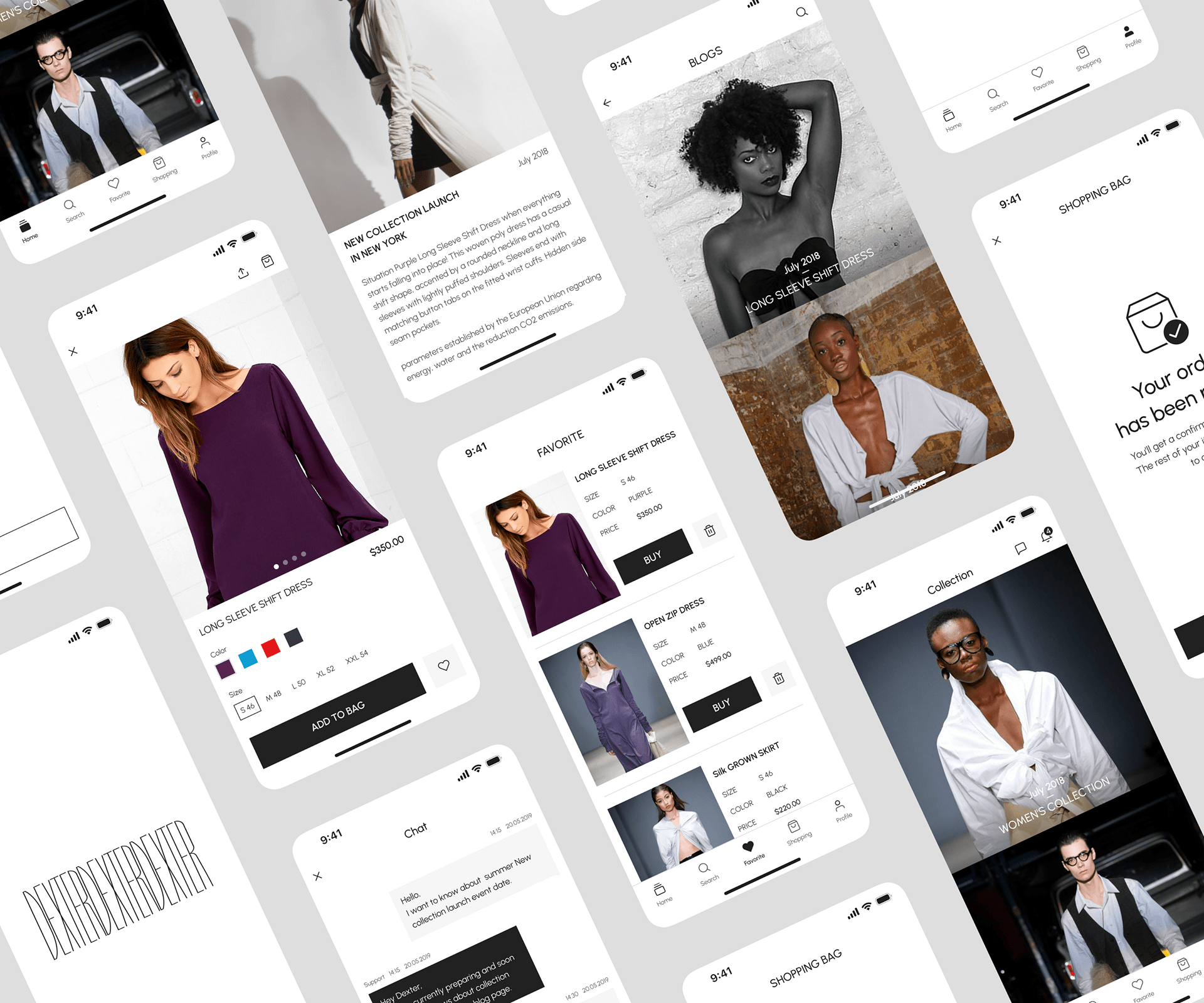
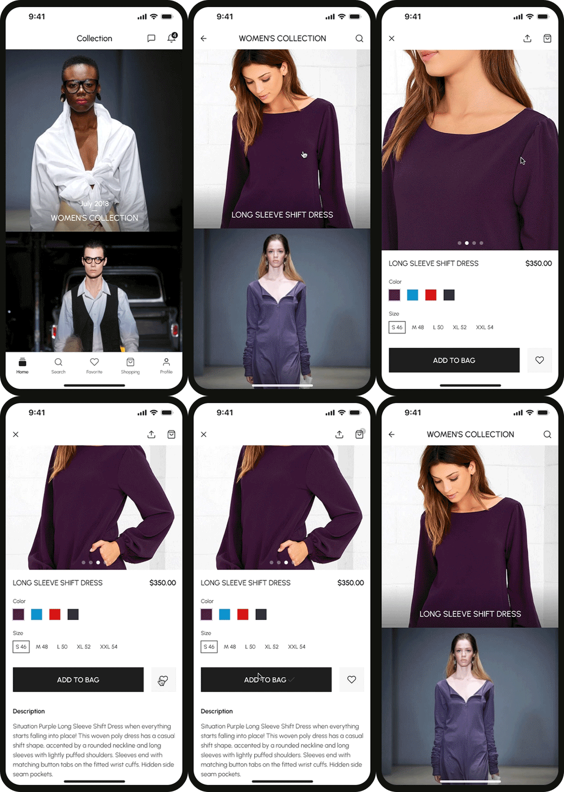
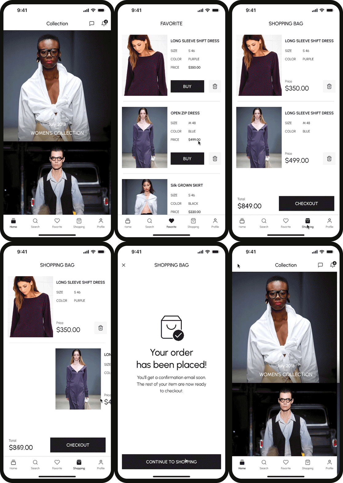
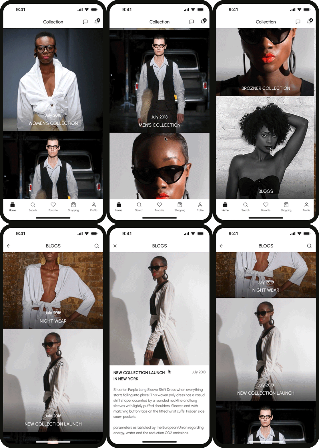
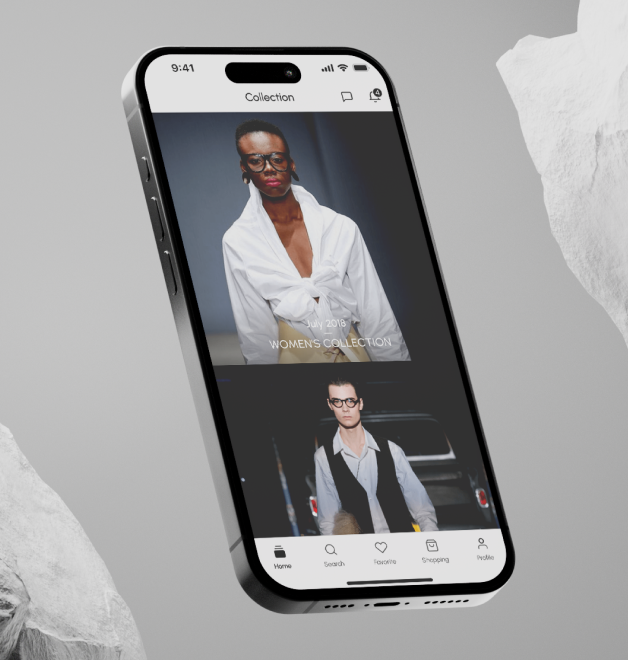
At this stage, all that’s left is bringing all the elements together— the features defined in the initial mockups, the app layout derived from the sitemap, and the UI features according to the design system.

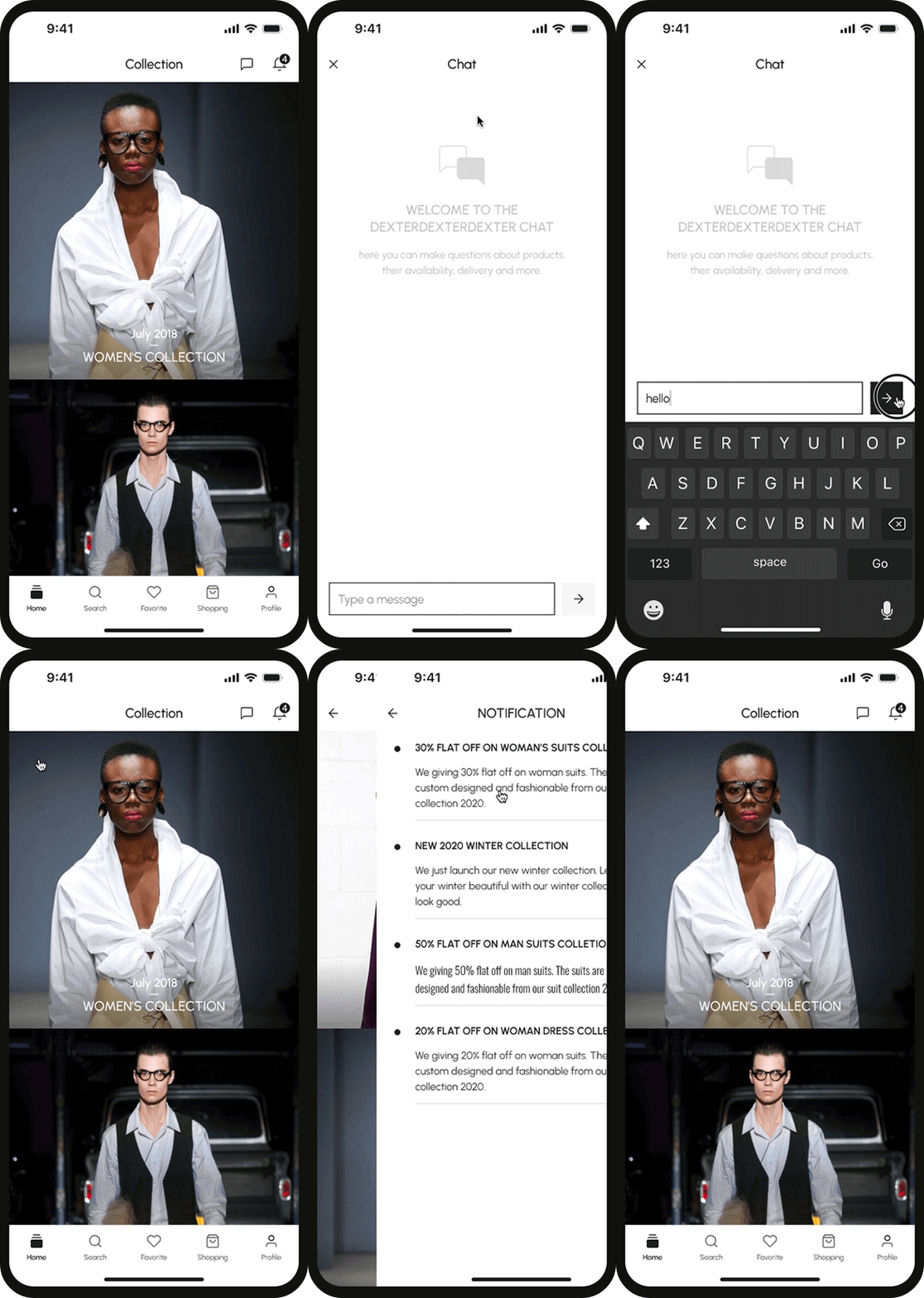
Collections

Details

Checkout

News Feed

Chat

Final Thoughts

After releasing a private beta and observing some changes, the initial research and usability tests provided a strong foundation to scale the app. I believe design can significantly aid public protection, disaster relief, and safety efforts. Mission-critical communication apps offer secure and reliable services. This project allowed us to develop a user-centered app and test it with real users, demonstrating that focusing on intuitive, appealing, and easy-to-use products presents a great opportunity for MCX applications.